I am so excited to write this year’s color trend and share with you the wonderful hues which will connect us with nature, liven our homes and work spaces, and bring a bit of fresh air into the gray palettes we have been working with. It’s no surprise to any of you that we are so hungry for a change. Last year we had color take a fresh new look but in 2022, the colors are beginning to get a bit bolder. The last ten years of “gray” are beginning to cycle out and color is becoming warmer. No, we are not jumping back into browns. Color is being immersed in nature, even more so than last year. So, get out your paint brush and rollers, we are going to explore your next room update, accent wall or cabinet color to bring nature INTO your home!
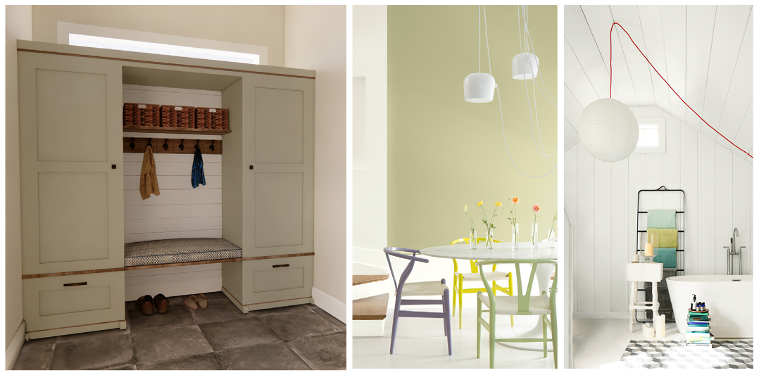
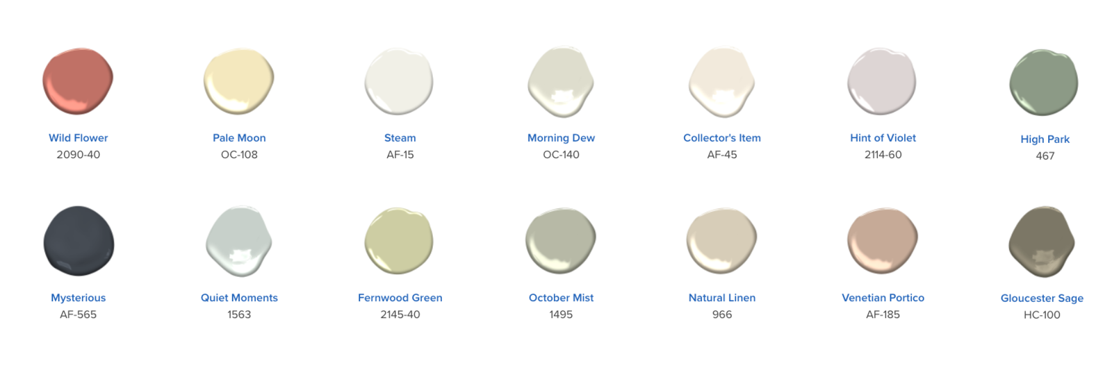
As an interior designer, I sit on the edge of my seat each year waiting for the announcement of the new upcoming year’s colors. Sounds nerdy but it thrills me to see the context in which the experts developed their selections from. As world travelers, they absorb how color is woven into our world. For this year, it is no surprise that greens have topped the list. Even in our own area of Saratoga Springs, Malcolm Snowden from Allerdice on Walworth Street stated, “Gray is falling by the waste side, more lively colors are on the rise; more than simple pastels, with a greater desire for more color. Warm and inviting colors that are comfortable to live in, relaxing.” He mentioned “One of the big sellers in Benjamin Moore’s Color of the Year palette is October Mist 1495.” I couldn’t agree more! I jumped right on that color for a custom Mudroom Cubby area accented with oak stained in Minwax Classic Gray. See, the gray is still here, but taking more of a back seat. When I asked Malcolm about THE white customers are asking for, it was the go-to white which has been around for years, Benjamin Moore Simply White OC-117. Time to shake things up a bit, wouldn’t you say?! The whites in BM 2022 palette are softer and convey a sense of relaxation. Steam AF-15 is a warm white but without the yellow undertones, allowing it to read white on walls and trim while offering a sense of comfort. Collector’s Items AF-45 is perfect for balancing your treasured finds and heirlooms that are abundant in our historical area. Its off-white hue has a quiet blush undertone which feels restful. My first reaction was, if I could touch the color… it would feel like an old shammy shirt that was washed to the perfect softness. Give them a try! Allerdice can make up samples so you can see your selection before buying the entire gallon. Malcolm also recommends to “Pay attention to the lighting in your room. A soft color will get washed out by the southern bright sun.” I usually place a large color swatch on all four walls of my client’s room with a white piece of paper behind it so the color reads true in that space, not influenced by the existing wall color. Then, I instruct them to look at the color at different times of the day to see how the natural light and outside elements will influence the new color. It’s a good practice to use when updating any room.
Back to greens…which have dominated the color selections for 2022. Other greens by Benjamin Moore included Morning Dew OC-140 which is a very soft white with green undertones. It’s a lovely wall color paired with Steam AF-15. Quiet Moments 1563 is one of my favorites. The cool mint green color is always refreshing without taking over a space. Fernwood Green 2154-40 if a soft yellow-green pulling us out of the gray undertones and into a truly fresh look into the future. High Park 467 reminds me of an English Library but without all the stuffiness. Sophisticated & enduring while surrounding one’s mind with a quiet place to read. Gloucester Sage HC-100 is a mossy green with brown undertones. Its rich, deep color would be elegant painted in a high gloss sheen for a library room filled with bookshelves; implying a secret door hidden somewhere that leads to a room filled with maps of intrigue and mystery.
Sherwin Williams declared Evergreen Fog SW9130 their Color of the Year. This “green-meets-gray” color gets a spark of coolness with slight undertones of blue. Pairing well with Shoji White SW7042, the colors offer a modern sophisticated scene for those who adore the gray palette but need to introduce a bit of nature to calm the palette. Pittsburgh Paints on the other hand selected Olive Sprig MEN7169-4. Their overall palette is grounded in a traditional and authentic feel. I love their tag line for this year’s color “VINTAGE IS THE NEW MODERN”. Olive Sprig MEN7169-4 evokes the past, present and the future. Olives, its timeless color has been cherished for centuries whether eaten from a tree, pressed into oil or dropped into a martini…And now, its bounty can enrich your home!
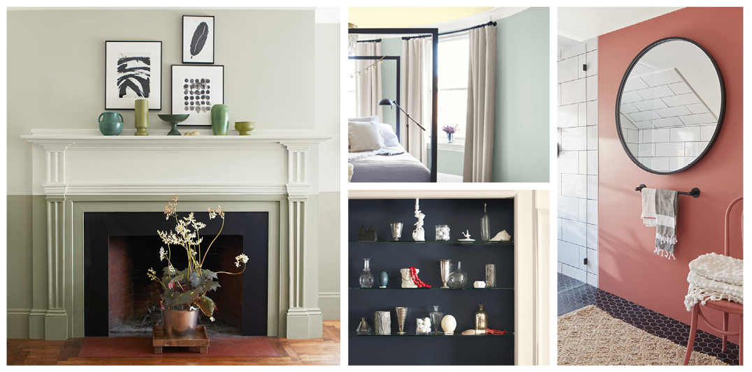
Now let’s add a pop of color! Starting with Benjamin Moore’s Wild Flower 2090-40. This rich rosy color allows your own personal style to shine through! Paired with Collector’s Item AF-45 for the trim, the balance creates a chic atmosphere without consuming your attention for color. Pale Moon OC-108 reminds me of a Lemon Chiffon Pie more so than the moon. It evokes the natural color of the peel as its lightly churned into the pie mix. Hint of Violet 2114-60 is a subtle lavender with a gray nuance about it. In the sunlight, the violet will pop to life while in the evening hours, the subtle gray tones will emerge creating a serene oasis to rest.
Mysterious AF-565 is a deep, rich blue perfect for a front door or cabinet accented with gold brushed hardware and natural woods. On the contrary, Natural Linen 966 is perfect for a serene bedroom with its sandy tones of rustic elegance. Paired with Collector’s Item AF15, it would be the next best place to rest when the ocean is miles away. And Finally, Venetian Portico AF-185 with its earth baked blush vibe denotes health with a calmness that comes from not being stirred easily; a security, a women’s perfect blush compact …at the ready. It feels as if you could brush it on with a light touch then dance the night away in the room without worry.
 Do you feel it? The tranquility flowing over you with these colors? The greens…the pops of soft to bold colors enticing you to enliven your homes into a new year and to celebrate the outdoors within your walls. Well, get those rollers and brushes working…And dare to be part of nature!
Until next time my friends,
